Tante Anne · ten landing page variants
Ten different directions for the same content. All follow the Business Model Canvas of 2 October 2026: the core message, the four customer segments, the three value propositions, the three-question onboarding, the managed monthly package with a 12-month minimum, the mainly free first pilot and the open price.
Variants 1 to 5 are the first round. Variants 6 to 10 leave the website idiom on purpose: a letter, a newspaper, a record sleeve, a blueprint and pictorial statistics.
Pick the direction first, then we refine copy, images and language.
-
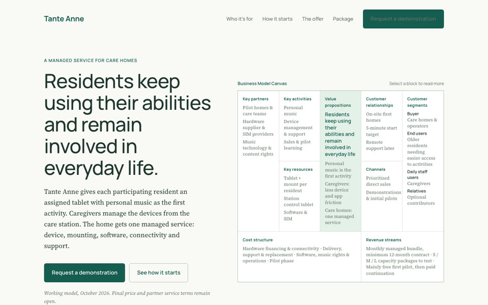 Variant 1
Canvas
The canvas is the page. The hero shows the nine blocks; each block links to a section that expands it. Continues the teal-and-cream look of the existing canvases.
Tone calm, structured, trustworthy · Type Manrope + Source Serif 4 · For operators who already know the canvas
Open variant 1 -
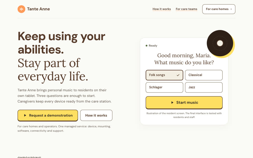 Variant 2
Music room
The product's own style guide applied to marketing: cream, brown, yellow music action, orange, the two-part heading (bold sans, soft serif) and an illustration of the resident screen in the hero.
Tone warm, personal, product-like · Type DM Sans + Lora · For care teams and relatives as much as buyers
Open variant 2 -
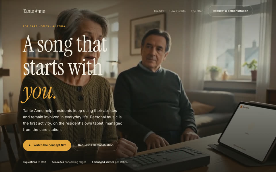 Variant 3
Film
Dark, cinematic, led by the concept trailer. "A song that starts with you." Scenes scroll past a sticky still. The film is labelled as a concept film; the controller shown is not part of the offer.
Tone emotional, quiet, premium · Type Instrument Serif + Inter · For a first impression, events, investors
Open variant 3 -
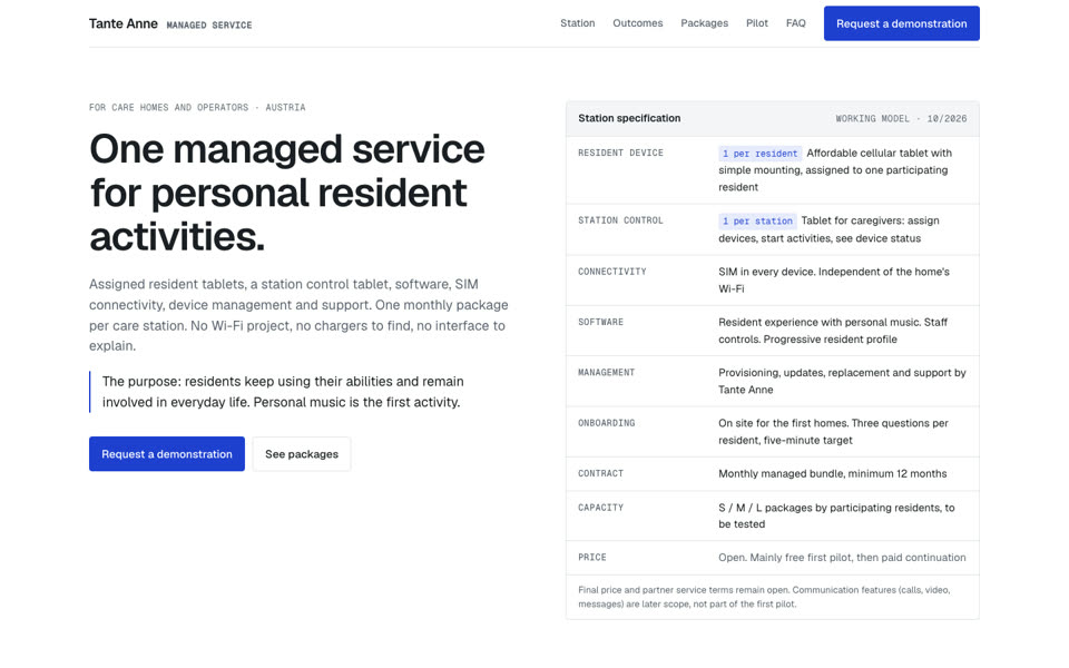 Variant 4
Managed service
Buyer-first and dense: a station specification in the hero, a station diagram, an S/M/L package table without prices, a pilot path and an FAQ with the questions operators ask first.
Tone precise, operational, honest · Type Geist + Geist Mono · For operator management and procurement
Open variant 4 -
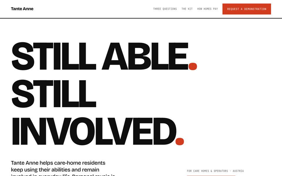 Variant 5
Poster
Typographic and bold. "Still able. Still involved." Full-width bands, three-pixel rules, mint and butter tiles, coral as the only signature colour. The riskiest direction on purpose.
Tone confident, campaign-like · Type Bricolage Grotesque + JetBrains Mono · For standing out, recruiting pilot homes
Open variant 5 -
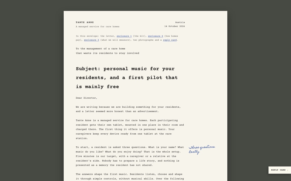 Variant 6
Letter
A typed letter from the team to the management of a care home, on paper, signed in blue ink with notes in the margin. Three enclosures (the kit, how homes pay, what we measure), two photographs and a reply card.
Tone personal, plain, honest · Type Courier Prime + Homemade Apple · For a first contact with a director, a mailing that could also be printed
Open variant 6 -
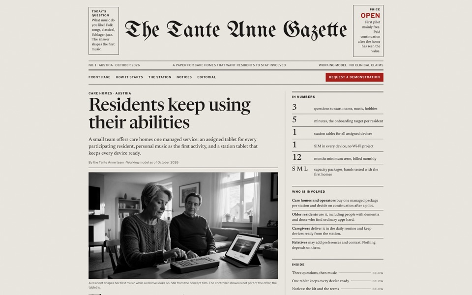 Variant 7
Gazette
A newspaper front page. Fraktur masthead, "Price: open" where the cover price would be, a lead story in columns with a drop cap, notices for the kit and the terms, an editorial on what we do not claim, and a coupon to cut out. Photos in black and white.
Tone familiar, editorial, dry · Type UnifrakturMaguntia + Newsreader + Libre Franklin · For the residents' generation and print-minded operators
Open variant 7 -
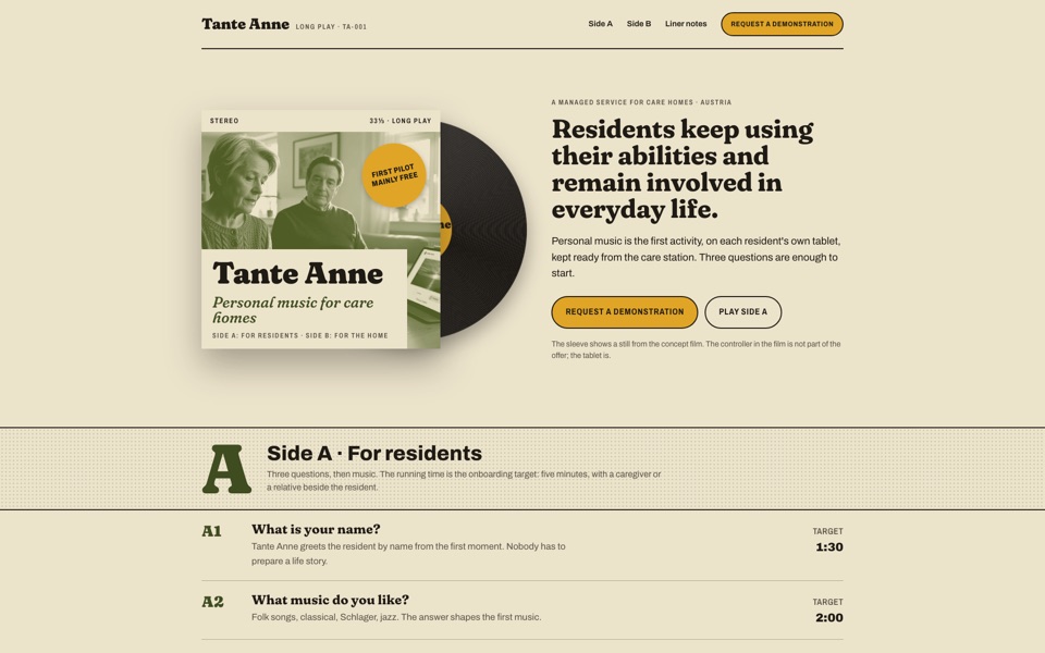 Variant 8
Record
A long-play sleeve from the residents' youth. Olive duotone still, a disc that peeks out of the sleeve, Side A for residents (three questions, running time 5:00), Side B for the home, liner notes and an order form.
Tone warm, nostalgic, playful · Type Fraunces + Archivo · For making music the first impression, events, relatives
Open variant 8 -
 Variant 9
Floor plan
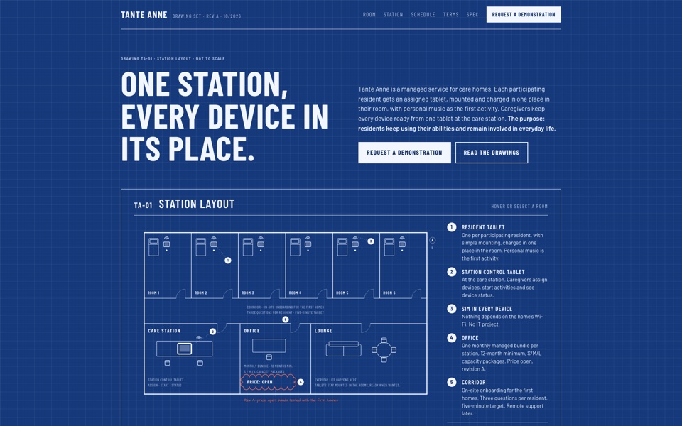
A blueprint of one care station. Interactive plan with six rooms, the station, the office and the lounge; detail sheets, a device schedule, commercial terms with a revision cloud around the open price, a specification and an RFI form.
Tone spatial, operational, precise · Type Barlow Condensed + Barlow + Architects Daughter · For operators who want to see where it goes in their building
Open variant 9 -
 Variant 10
Pictogram
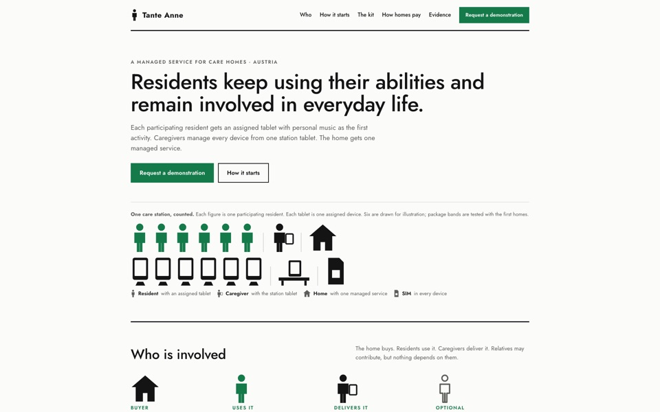
Pictorial statistics after the Vienna Method: one figure per resident, one tablet per figure, relatives drawn in outline because they are optional, S/M/L as rows of people, 12 months as squares, and what we do not claim as crossed-out symbols.
Tone clear, counted, honest · Type Jost · For explaining the model at a glance, slides and print
Open variant 10
All pages are in English, matching the canvases and the team material. Contact forms are prototypes and do not send anything. Fonts load from Google Fonts, so the pages need internet access. Images and the trailer are stills and footage from the concept film in the research repository.